 ColorBrew

The Lion photo has a warm gold highlight, several shades of brown, and a shadow that looks almost black. Those colors work together in the photograph. To use them on a website, you still have to decide which color goes behind the text, which belongs on a button, and which you can leave out.
This walkthrough takes the Lion sample from raw swatches to a website theme you can copy into CSS. You can follow the same steps with a landscape, a product photo, or your own artwork.
 FIELD GUIDE · 01
1. Start with six colors in Balanced mode
- Open Image to Palette and select the Lion sample. To use your own photo, select Upload or drop it onto the picker.
- Choose Balanced and set Colors to six. Look for a light tone, a dark tone, and a color you would use to draw attention.
- Drag a sample point over the lit fur to pick a warmer color, or move it into the shaded mane to pick a deeper one. You can also focus a point and move it with the arrow keys.
Start with six so you can see the main colors without sorting through too many similar shades. Use the + control to add colors up to twelve. Try eight when you need a few more accents, or twelve when you want a wider set for a mood board or illustration. Use − to go back down to four if several swatches are doing the same job. Adjust the count before fine-tuning your sample points, since changing it runs extraction again.
2. Try another mood when the first result misses a color
- Balanced emphasizes the colors most present in the image. Start here when you want the palette to reflect the whole photo.
- Vibrant favors bolder colors. Try it when a small, bright detail is the reason you picked the photo.
- Muted favors softer tones. Try it when the first palette feels too saturated for a background or editorial layout.
- Deep favors darker tones. Try it when you want to explore the shadows for a dark surface.
A bright object can take up very little of a photo. If the picker misses it, drag a point directly onto it. For a simple interface, four well-separated swatches are often easier to work with than six nearly identical shades.
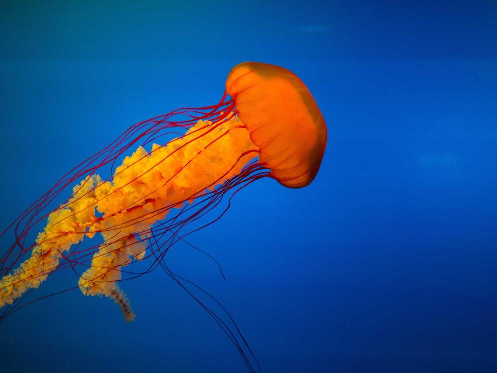
- BalancedThe colors most present in the photo
- VibrantMore weight on saturated details
- MutedMore room for quieter tones
- DeepMore weight on shadow colors
3. Read and copy the color values
Switch the picker between HEX, RGB, and HSL. Each shows the same swatch in a different notation. Click a swatch to copy the currently displayed value.
- HEX is a compact code such as
#A3652B. It is easy to paste into a design tool or stylesheet. - RGB gives the red, green, and blue channels. The same brown is
rgb(163, 101, 43). - HSL describes hue, saturation, and lightness. Use it when you want to reason about making a color softer or lighter.
- CMYK uses cyan, magenta, yellow, and black inks. The picker displays HEX, RGB, and HSL. For print, take the extracted swatch into your design software and convert it with the color profile your printer specifies.
4. See your palette at work.
Scroll to See your palette at work, choose Website, and use the Light preview. ColorBrew assigns roles and can derive lighter or darker values from the extracted colors. For example, the cream background below is a lightened version of the gold in the photo. To reproduce this theme, reload the picker for a fresh six-color Lion palette, then select the Accent chip until it reads #D69842.
- Background
#F6E8D5The main page canvas- Surface
#EFDEC7Cards and inset sections- Text
#070904Headings and body copy- Primary
#A3652BThe main button- Accent
#D69842Badges and small highlights
Use the primary brown on one important button, such as View collection. Save the gold for a small label or an illustration detail. Select Shuffle to try another assignment, or select an individual role chip to cycle through swatches. Switch to the Mobile app, Web card, or Social post preview if that is closer to what you are making.
- Website shows how a palette works across page backgrounds, text, and calls to action.
- Mobile app gives you a tighter layout for judging surfaces and small text.
- Web card lets you check how a few roles work together in a compact component.
- Social post shows how the colors feel in a graphic where an accent can take up more space.
Switch between Light and Dark to see how the role assignments change. Use Copy theme to take the current preview into your stylesheet.
5. Check the colors that actually touch
Put the foreground and background hex values into the contrast checker. Here are the three foreground and background pairs from the example.
- 16.59:1Page text
- 4.72:1Button label
- 8.03:1Badge text
Check the page text, button label, and any badge separately. If you shuffle the theme, switch to Dark, or lighten the button for a hover state, check the new pairs where they appear in the design.
6. Save, export, download, or share
Save a palette for later
Select Save in the picker. The palette goes to Saved Palettes in the same browser. Use a link or download when you need to take it to another device or hand it to someone else.
Export code for your project
Select Export and pick a tab. Choose CSS for custom properties, Tailwind for a configuration snippet, or SCSS for Sass variables. Choose JSON for named color values or Array for an ordered list of hex codes.
Under More formats → Choose a framework, you can also choose JavaScript, TypeScript, styled-components, Chakra UI, or Material UI. The code preview changes with your selection. Use the Copy button for the selected format, then paste the snippet where your project defines its colors.
Download a PNG or PDF, or copy a link
- Download PNG puts the photo and its swatches into one image. Drop it into a mood board or design handoff.
- Save as PDF downloads a palette reference you can attach to a brief or print.
- Copy Link shares the extracted colors. Opening the link loads those colors in Palette Studio. The photo and its preview theme stay out of the link.
Use the applied theme in CSS
The Export dialog uses the extracted swatches. For the assigned background, surface, and button colors from the preview, use Copy theme.
Paste the theme variables into your stylesheet, then use them like this.
.photo-theme {
  background: var(--color-bg);
  color: var(--color-ink);
}

.photo-theme .card {
  background: var(--color-surface);
}

.photo-theme .primary-button {
  background: var(--color-primary);
  color: var(--color-onPrimary);
}
Try it with your own photo
Pick a photo that has one detail you want to carry into the design. Start with Balanced, sample that detail by hand if needed, then make one background, one text color, and one accent work together before adding more. Open Image to Palette.
Lion sample photo by Dede Yulana.